Landing Page Optimization: A Practical Audit, Real Examples, and Test Plan

A landing page can look polished and still leave visitors unsure about the offer. It can also collect plenty of submissions while attracting people the business cannot help.
Landing page optimization means improving a page's ability to help the intended visitor understand an offer and complete an appropriate action. That includes message alignment, usable design, relevant evidence, reliable forms, and the experience after the click.
Start with the visitor's job and the action the page should support. Then diagnose where the experience breaks. A headline change cannot repair a missing download, and a shorter form is not automatically better for a request that needs qualification.
This guide uses seven real page examples to explain different decisions, followed by an audit worksheet and experiment plan. These are public-page observations, not claims about the brands' conversion results. Proposed revisions are clearly labeled suggestions.
Define the page and its intended action
In analytics, a landing page can mean any first page in a visit. In campaign design, it often means a focused destination for a particular audience, promise, and action.
Use the campaign meaning when planning optimization, while remembering that articles, product pages, and directories can also receive first visits.
| Page or offer | Visitor's job | Useful action | Quality outcome |
|---|---|---|---|
| Newsletter offer | Decide whether ongoing content is relevant | Subscribe with clear expectations | Relevant retained subscribers |
| Resource offer | Understand and access a useful asset | Request or open the resource | Successful access and use |
| Trial entry | Begin evaluating a product | Start the trial or account | Meaningful product use |
| Sales inquiry | Determine whether the provider can help | Request an appropriate conversation | Qualified accepted inquiries |
| Local service page | Establish geography, scope, and fit | Contact or book relevant help | Serviceable inquiries |
Write one primary action for your page. Supporting actions can help someone inspect evidence or find the right route. Remove distractions only after understanding whether they serve a legitimate visitor need.
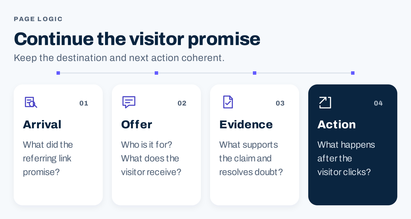
Original page logic. The message and action should remain coherent from the referring placement through the destination.
Seven real examples to inform an audit
1. Marketing Brew: make the short form's value obvious
Marketing Brew's subscription page identifies its audience and recurring editorial value beside the email entry.
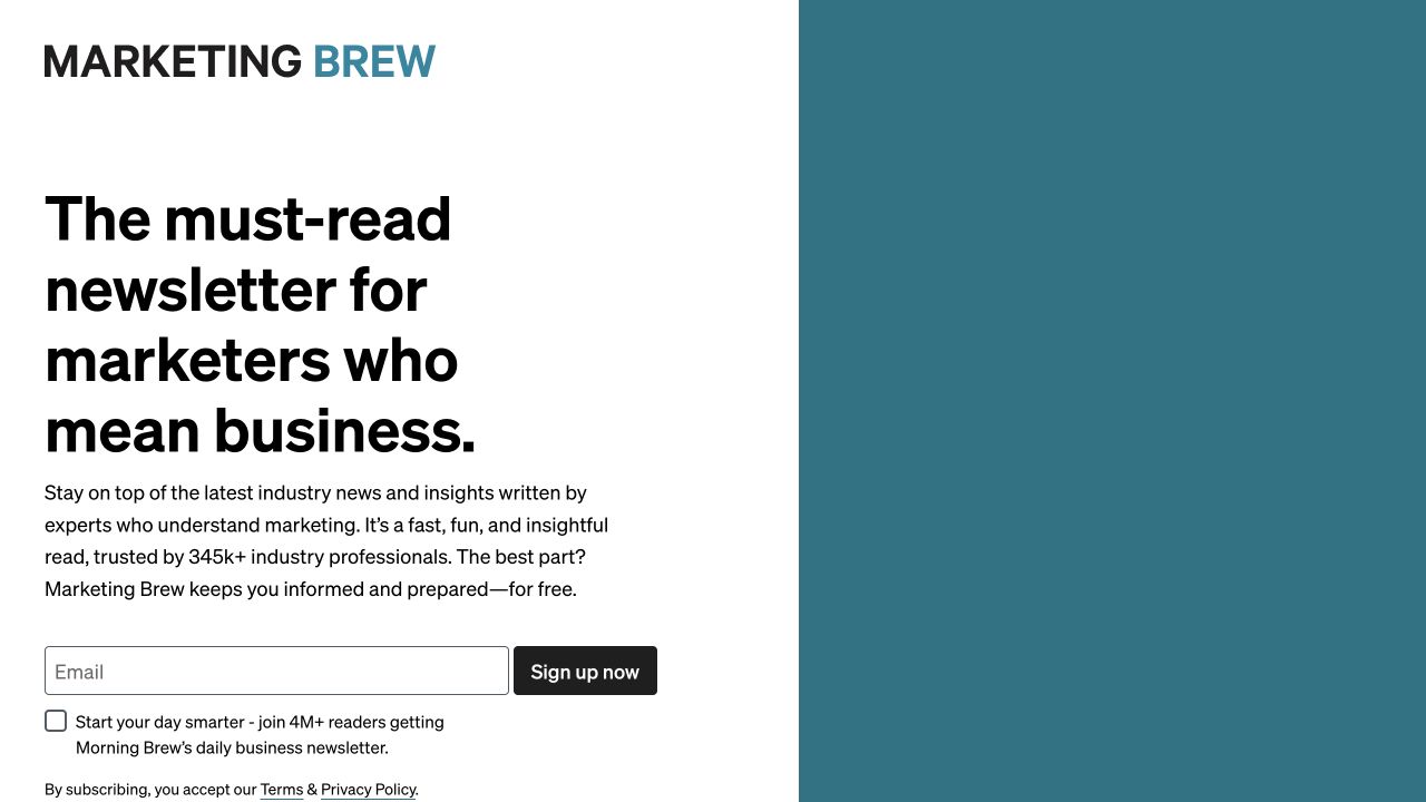
Source: Marketing Brew, desktop capture, October 7, 2026. The visible request is a newsletter subscription, not a sales inquiry.
The useful lesson is the connection between explanation and action. The reader can see what they are joining before giving an email address.
For your page, check whether the first screen explains whom the offer helps, what it provides, and what the button does. A form above the fold is only helpful if the surrounding message gives the visitor enough reason to use it.
2. Slack: longer forms can serve a different job
Slack's contact-sales page uses business and contact fields alongside an explanation of sales-related help. It also directs other needs toward support.
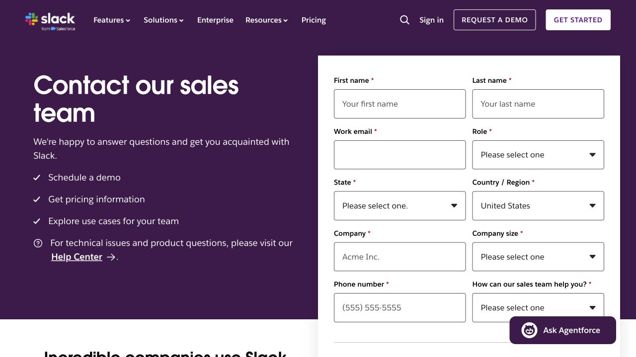
Source: Slack, desktop capture, October 7, 2026, with United States selected. No inquiry was submitted.
A sales inquiry may need information that a newsletter does not. The right question is what each field changes in the response or qualification process.
Before removing fields, ask the receiving team how they use them. Before adding fields, ask whether the same information can be collected later. Evaluate both submission rate and accepted inquiry quality.
3. Shopify: a trial page should lead into useful product evaluation
Shopify's free-trial page combines a business-building message, email entry, a start action, and supporting visual material.
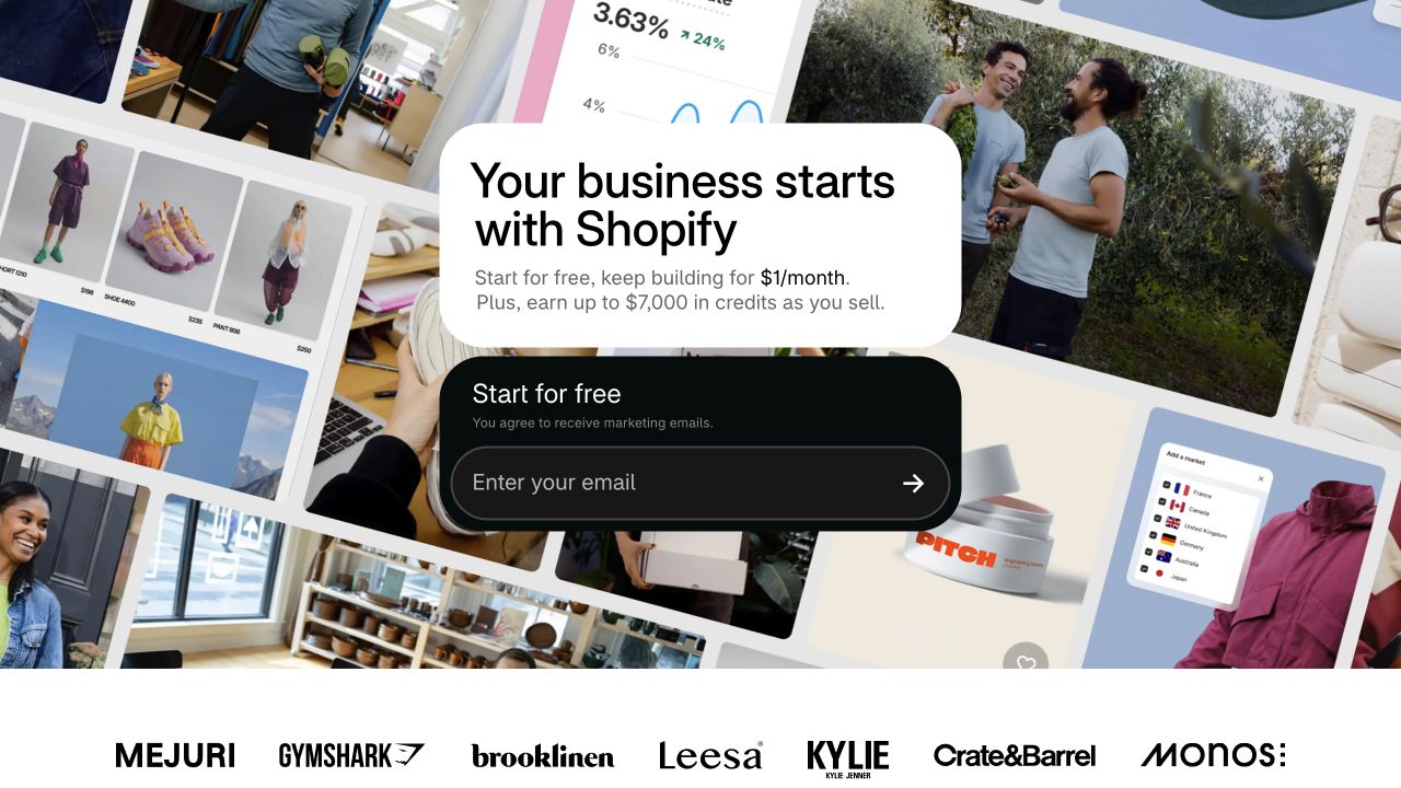
Source: Shopify, desktop capture, October 7, 2026. This is a structure observation; localized terms and promotional pricing are not adopted as US offer facts.
The conversion is the beginning of evaluation. Review what happens after the start action: account creation, setup instructions, access conditions, and the first useful task.
A page that increases signups but leaves more people unable to use the product may have improved the wrong metric. Define the later quality outcome before testing the entry page.
4. Bluewire Media: a preview helps explain the deliverable
Bluewire Media's checklist offer names a free two-page PDF and previews its practical scope.
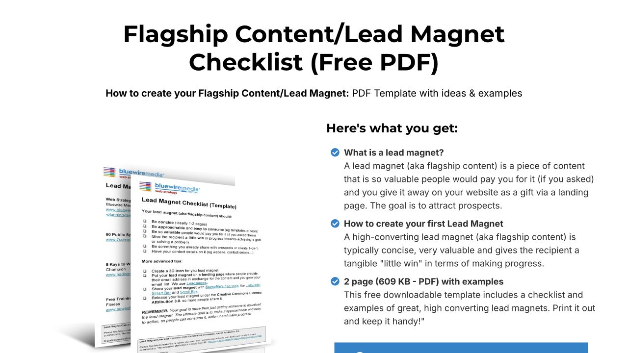
Source: Bluewire Media, desktop capture, October 7, 2026. The subsequent form did not fully render during inspection; the screenshot establishes the offer, not successful delivery.
A concrete preview can answer “What will I receive?” more clearly than decorative artwork. Show actual fields, an excerpt, or a contents list that represents the resource accurately.
Then check access separately. A visitor can understand the offer and still fail to receive it. Those are different issues requiring different fixes.
5. HubSpot: explain substantial value without hiding its scope
HubSpot's State of Marketing page gives the report a dedicated explanation and access action.
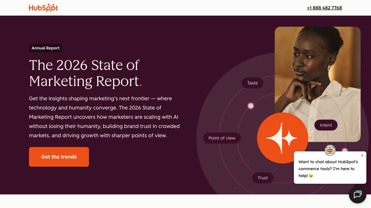
Source: HubSpot, desktop capture, October 7, 2026. The page describes a research resource; its conversion performance was not tested.
An evidence-heavy offer needs context: topic, edition, intended audience, and what the report contains. Keep the source method and limitations available in the resource.
Choose proof that supports the specific offer. A recognizable logo can communicate association, but it does not by itself establish the quality of a particular report or the result a visitor will achieve.
6. Shopify's business-plan offer: inspect promise-to-action alignment
The Shopify lightweight business-plan page visibly describes a free download, while the displayed button says “Start free trial.”
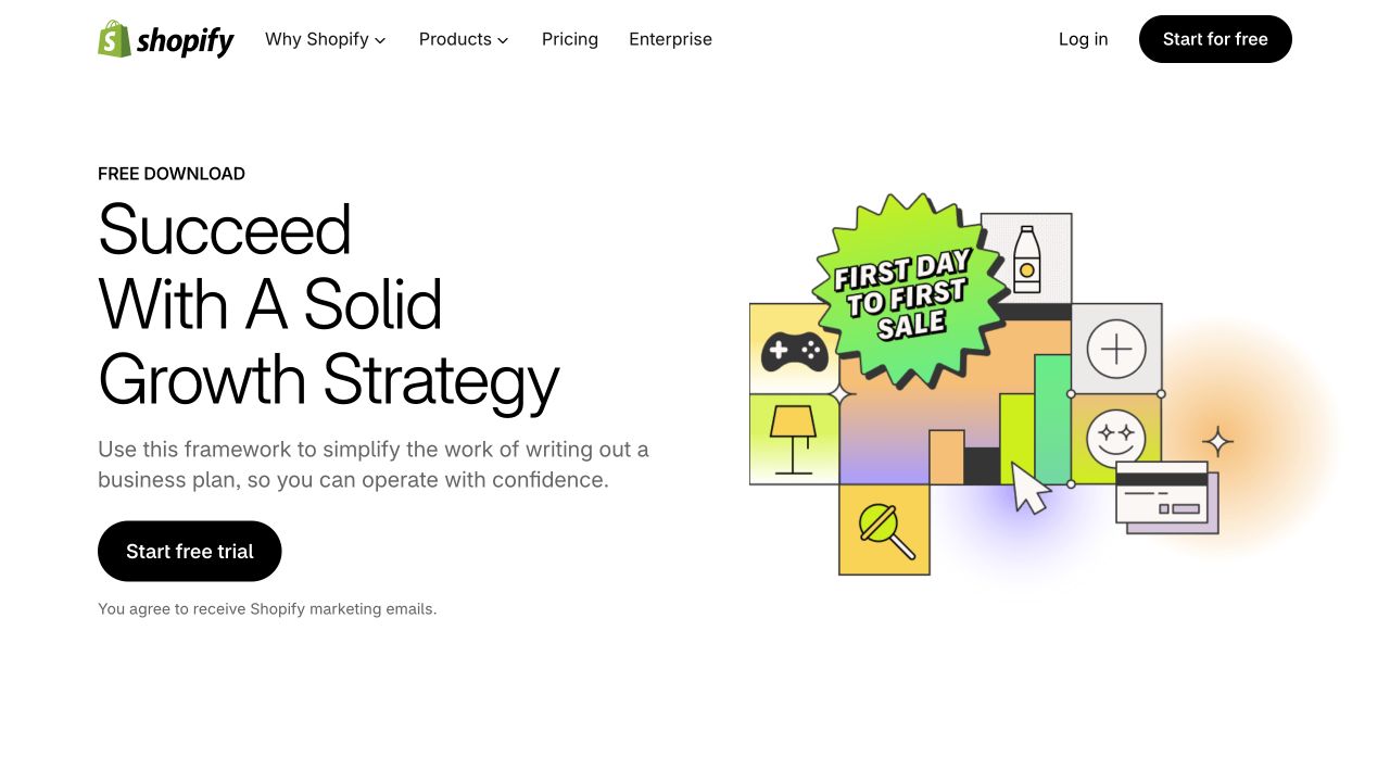
Source: Shopify, desktop capture, October 7, 2026. The visible resource promise and button name differ. The complete post-signup journey was not tested.
This is a diagnostic observation, not proof that the page performs poorly or that the file is unavailable. It raises a useful question: does someone expecting a business-plan download understand why the next action begins a trial?
Proposed revision to test: make the relationship explicit. If an account is required for the resource, explain that condition beside the button. If the download is independent, give it a matching action and make the trial a clearly described secondary option.
Test the actual journey before deciding which revision fits. The goal is an accurate expectation, not merely a more attractive button.
7. SCORE: navigation can help a service visitor establish fit
SCORE's mentor directory supports finding relevant expertise before making a request.
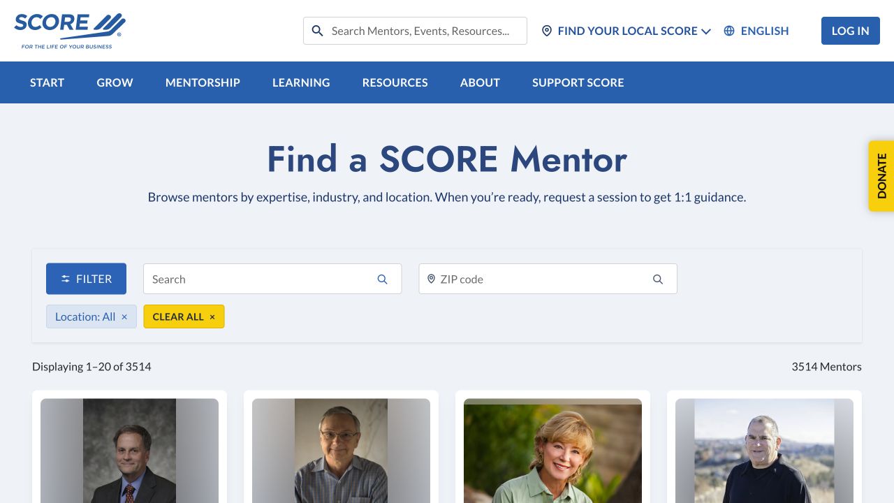
Source: SCORE, desktop capture, October 7, 2026. This is a broader service directory, not a single-campaign landing page.
It is a useful counterexample to removing every navigation option. A service visitor may need a specialty or location match before contacting anyone.
For a local service campaign, state the service area, actual service, relevant proof, and contact expectations. Use real local information and imagery when available. Do not create near-identical pages with changed city names and imply a presence you do not have.
Diagnose problems in the right order
1. Check the complete action path
Use authorized test details in your own system. Check the button, validation, submission, confirmation, actual delivery, and downstream record. Include mobile devices and failure states.
Fix known broken links and forms before running persuasive-copy experiments. A visual page review cannot establish that the server, email delivery, or CRM handoff works.
2. Compare the arrival promise with the page
Read the referring ad, email, or link beside the headline and action. Compare audience, offer, terms, and wording. If the referring placement promises a resource but the page mainly sells a trial, resolve that expectation.
Inspect traffic sources separately. A page can fit one campaign and confuse visitors arriving through another. Aggregate conversion rates can conceal this mismatch.
3. Check whether the offer is understandable
Ask a person unfamiliar with the page to explain what it offers, whom it helps, and what happens after the click. Record their answer and points of hesitation.
This is useful diagnostic feedback, not a statistical conversion test. If multiple readers misunderstand the same fact, revise that explanation before testing minor decoration.
4. Inspect relevant evidence and objections
Identify what the visitor needs to believe or know before acting: scope, compatibility, deliverable, access conditions, price where relevant, or who will respond.
Support the claim with appropriate evidence. A screenshot demonstrates an interface; a documented case can explain a use; a clearly sourced result can support a bounded claim. Do not turn a testimonial into a universal guarantee.
5. Review effort and usability
Check field labels, error messages, keyboard operation, readable text, contrast, tappable controls, and content loading. Avoid assuming every extra field or long section is unnecessary. Judge it against the visitor's task and the team's response needs.
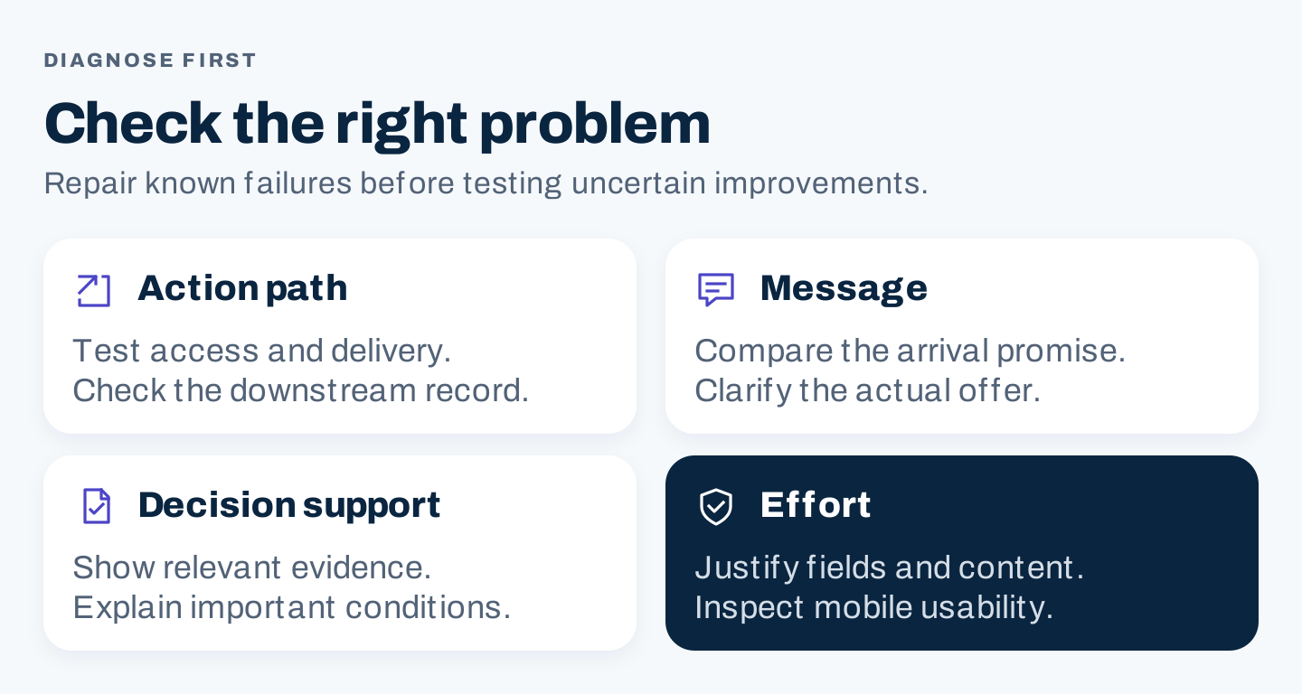
Original diagnostic order. Check the path, message, decision support, and effort before testing cosmetic changes.
Build the page around decision support
There is no universal required length. Use enough content to answer the questions that matter for this audience and action.
| Element | Reader question | Review check |
|---|---|---|
| Headline | What is this offer? | Names a relevant value without overclaiming |
| Supporting explanation | Is it for my situation? | Clarifies audience, scope, and mechanism |
| Preview or demonstration | What will I receive or use? | Shows the actual resource or capability |
| Evidence | Why should I believe this? | Supports the specific claim with context |
| Conditions | What commitments or limits matter? | Makes decision-changing terms visible |
| Form or action | What happens next? | Matches the promise and requests justified information |
| Confirmation | Did the action work? | Explains access and the next step |
Place the action where the visitor has enough context to choose it. On a longer page, repeated actions can be useful after relevant explanations. Keep their meaning consistent.
Decide which form fields belong
Create a field-purpose table before editing the form.
| Field | Keep when | Consider deferring when |
|---|---|---|
| Needed for requested delivery or response | The resource can be used openly | |
| Name | Needed for the immediate relationship or record | It adds no immediate useful function |
| Company | Business fit or routing depends on it | The offer is broadly educational |
| Company size | It changes service eligibility or routing | No current process uses it |
| Phone | The requested next step uses a call | Delivery is an email-only resource |
| Location | Service area or scheduling depends on it | Geography does not change the offer |
| Open-text need | A response requires problem context | A simple resource request needs no personalization |
This table offers decision rules, not a universal form specification. Explain sensitive or unexpected requests in plain language. Keep required and optional fields distinguishable.
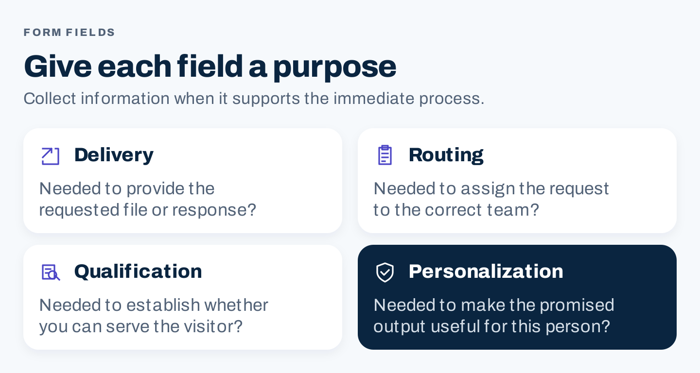
Original field decision guide. Delivery, routing, qualification, and personalization should each have a real process behind them.
Inspect the mobile experience as its own review
Use a real narrow viewport rather than assuming a desktop layout will shrink well. Review the first screen, headings, evidence, form, keyboard interaction, and confirmation.
Check that text is readable, labels remain visible, wide tables have a usable alternative, and floating chat or cookie controls do not cover the action. Verify that images do not reserve excessive blank space or cause the content to shift awkwardly while loading.
For local services, make the contact route usable on the device: clear phone or request actions, current hours where relevant, and accurate service-area information. Do not hide key conditions only in a desktop sidebar.
A mobile screenshot is one checkpoint. Complete a test of your own actual action path on mobile before treating it as verified.
Turn the audit into an experiment
Fix defects directly. Use experiments for uncertain improvements.
The Microsoft Research guide to pre-experiment planning describes planning hypotheses, metrics, and statistical power before running a test. Apply that discipline to a page change rather than adopting a fixed “run it for two weeks” rule.
Observation: [Evidence of a specific issue]
Hypothesis: For [audience/source], changing [element] will help
[visitor task] because [reason].
Control: [Current page]
Variation: [Focused change]
Primary metric: [Defined action with denominator]
Quality guardrail: [Qualification, activation, delivery, or other outcome]
Assignment and exclusions: [How eligible visitors enter the test]
Sample and duration plan: [Based on baseline, meaningful effect, and traffic]
Stopping and analysis rule: [Agreed before looking at results]
Owner and decision: [Who interprets and implements the result]
For the Shopify business-plan observation, a proposed test might clarify the resource/account relationship. The primary measure could be the relevant completed action; a guardrail could check whether people successfully access the promised resource. That is a proposed test design, not a performed experiment.
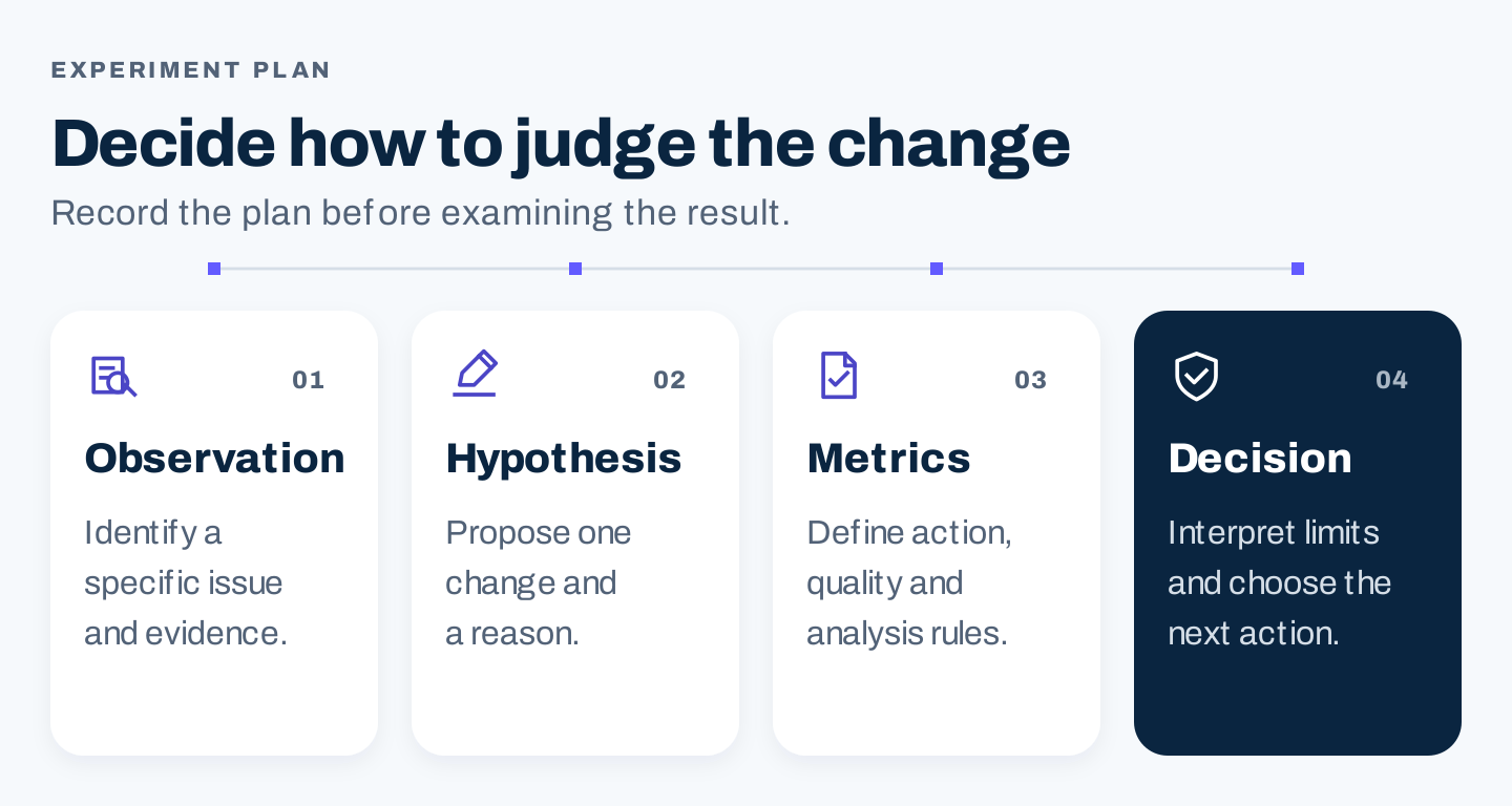
Original experiment framework. Decide how to judge the change before examining the result.
If the page has little traffic
Do not split a tiny audience across many variations and treat noisy differences as proof. Start with usability feedback, source-to-page checks, and repairing known failures.
If you compare a page before and after a change, record other influences such as traffic mix, seasonality, and campaign changes. That comparison can inform a decision, but it is weaker evidence of causation than a well-designed randomized test.
Measure the action and its quality
For illustration only, a page receiving 1,000 eligible visits and 50 valid inquiries has a 5% inquiry rate. If 10 meet the agreed qualification rule, its qualified-inquiry rate is 1% of eligible visits, and 20% of inquiries are qualified.
Those figures describe different parts of the system. A variation that increases inquiries while reducing qualified inquiries may create more work without improving the business outcome.
Compare consistent traffic segments and windows. Deduplicate submissions, exclude known tests and spam under written rules, and give later outcomes enough observation time. Use the lead generation guide to connect the page to response and qualification.
Copyable landing page audit
| Audit question | Evidence or answer | Priority and owner |
|---|---|---|
| Who arrives, and from which placement? | ||
| What did that placement promise? | ||
| What is the page's primary useful action? | ||
| Can an unfamiliar reader explain the offer? | ||
| Does the button accurately name the next step? | ||
| Is the preview genuine and representative? | ||
| Which claims need supporting evidence? | ||
| Are decision-changing terms visible? | ||
| What does each field change? | ||
| Does the whole action and delivery path work? | ||
| Is mobile access usable? | ||
| How are wrong-fit requests routed? | ||
| What is the quality metric beyond submissions? | ||
| Which uncertain improvement should be tested? |
Frequently asked questions
What is a good landing page conversion rate?
It depends on the action, audience, traffic, and offer. A newsletter subscription and a qualified sales inquiry have different commitments. Use your own consistent baseline and quality outcome rather than a generic rate as the target.
Should I remove all navigation?
Only when it distracts from the intended task without helping a legitimate decision. A focused campaign offer and a service-matching directory serve different needs; SCORE's directory illustrates the latter.
Is a shorter page always better?
No. A simple subscription may need little explanation. A complex service or substantial resource may need more decision support. Remove unnecessary content and preserve useful evidence and conditions.
How long should an A/B test run?
Plan around traffic, the baseline, the meaningful effect you want to detect, relevant business cycles, and analysis rules. A fixed number of days is not a substitute for that plan.